
services
Photography
Copy Writing
Design Systems
The brief
A visual documentation of sounds recorded around Boston.
Each picture is accompanied by a journal entry, written at the time it was taken, to create a soundscape brochure.
photography
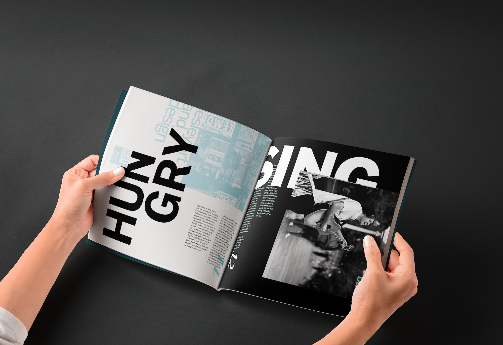
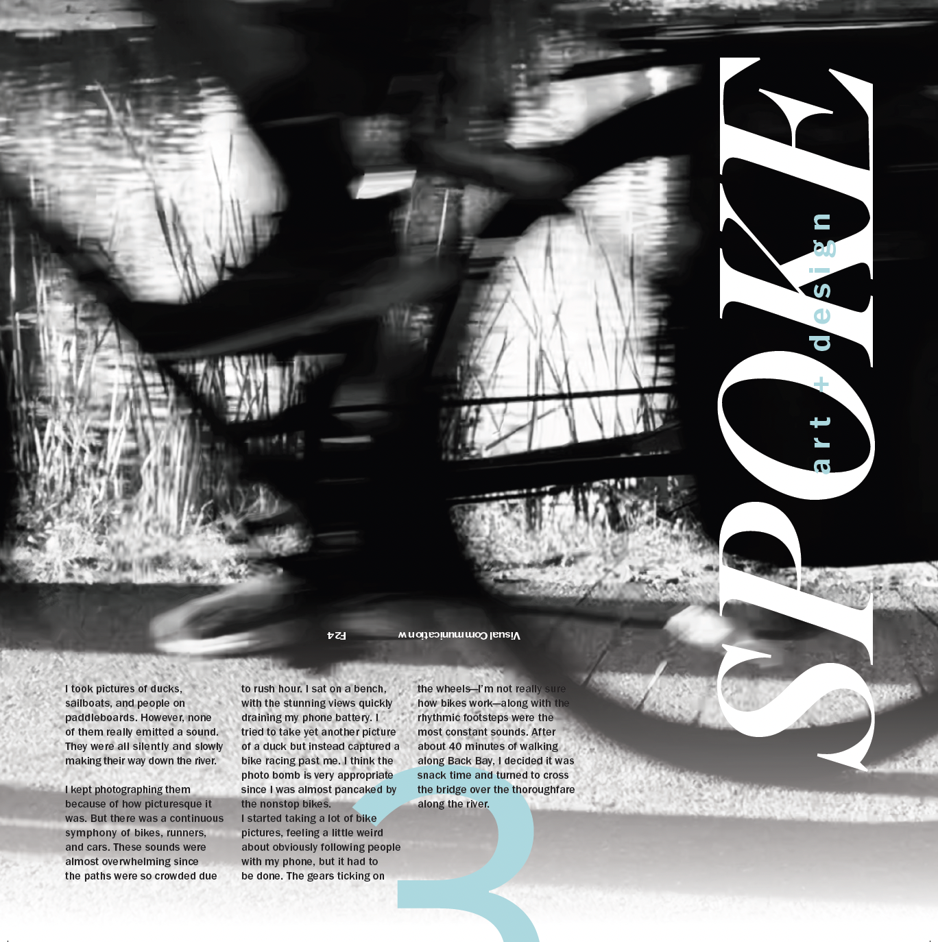
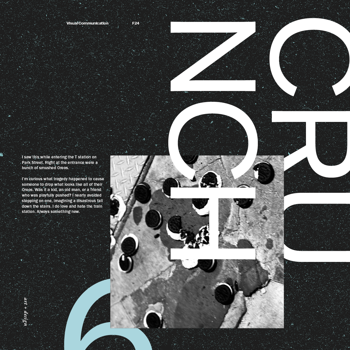
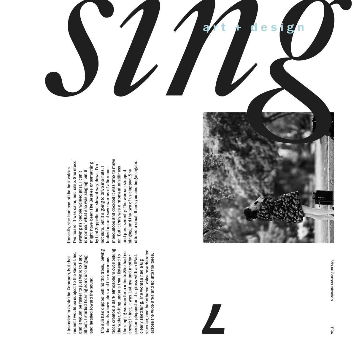
I walked for three hours in downtown Boston, no music, no distractions, and took a picture every time I heard a distinct sound. Each panel is in chronological order of when I took the picture to serve as a real journey for the reader.
I manipulated each photo to be abstract and less representational, so the focus falls on the word describing the sound first, and then recognition of the photo as added context.
Color
The type treatment and grid are the heros of the project while the color connects each page together.
The palette is limited to black, white, and light teal. The teal is calming and a bit somber, which is about how I was feeling on that day.
layout
Each page has the same elements rearranged on a grid. They are made up of the title, journal entry, page number, and “Lesley Art + Design”.
One or more of these elements interact with the page's edge, and the body copy stays consistent with type and treatment. Every other element is changed to visually align with the sound it is describing.
type
There are only two typefaces: Caslon and Franklin Gothic. I wanted the contrast between a serif and a sans-serif for the different emotions they can communicate. Various fonts are used within the two typefaces depending on the vibe of each page.


up next