


Services
Bradning
Photography
Copy Writing
the brief
The obvious choice for a compost symposium is earth tones and lots of mundane text on the importance of composting.
Personally, if I saw a brown and green, easy-to-read poster, I would quickly forget about it. My goal was to intrigue first and inform second.
I needed to design a campaign to advertise an informational compost event with an adaptable visual identity. And it had to be interesting.
Branding
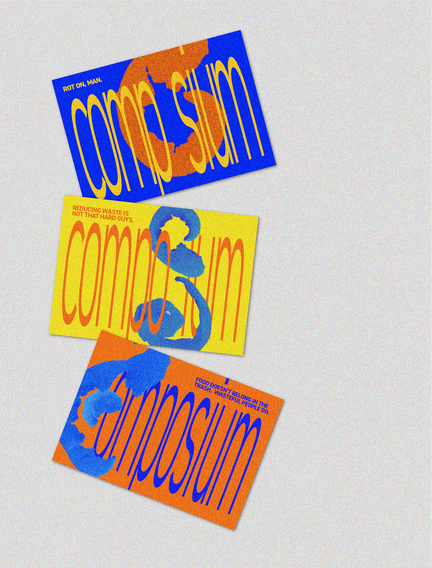
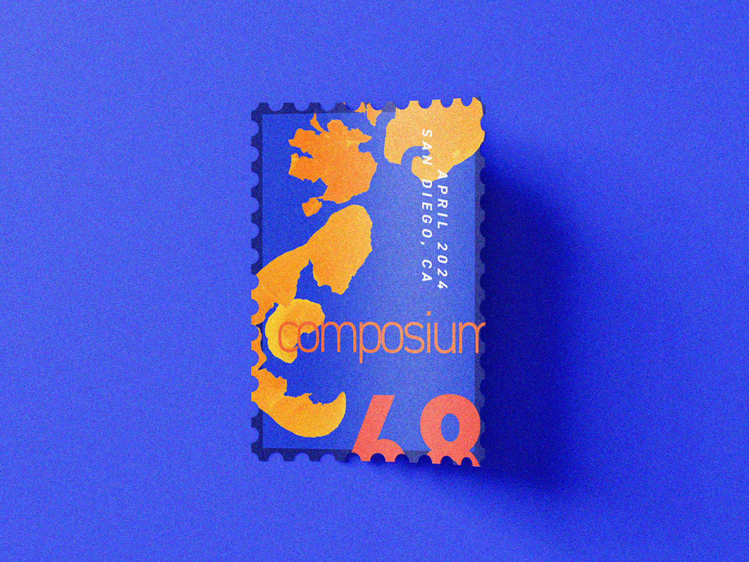
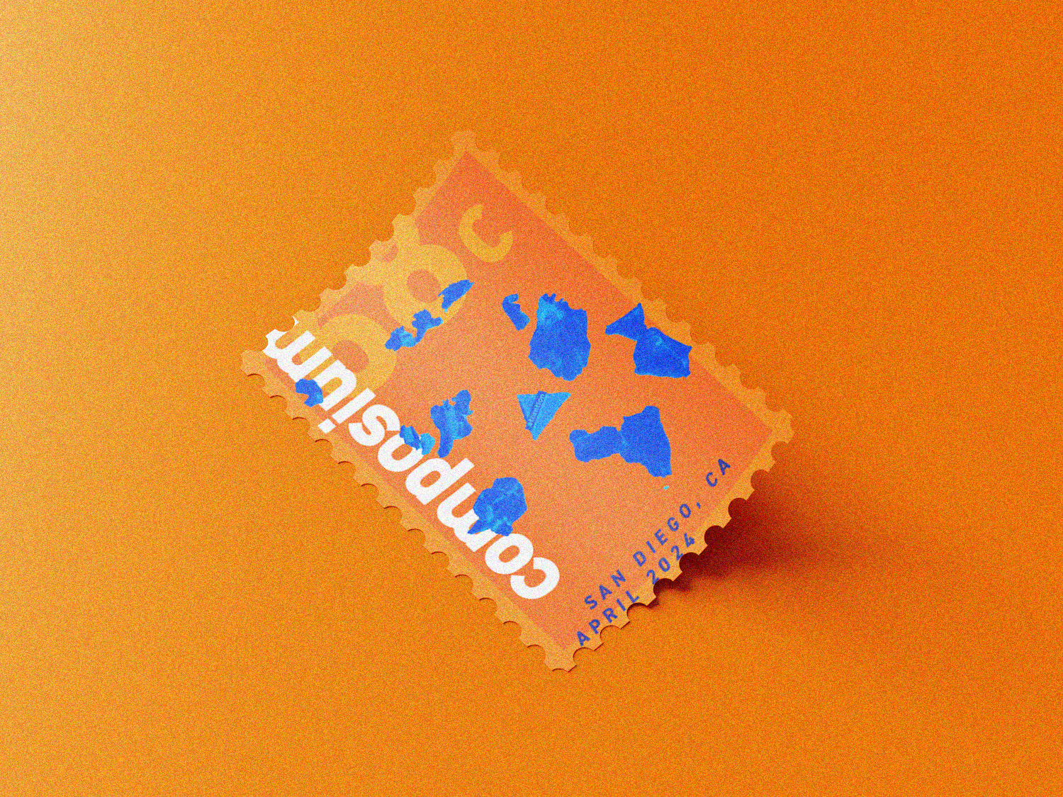
These had to be eye-catching and exciting; make compositing seem cool, because it is. I decided on electric, loud, and unnatural colors to create contrast between a subject matter and a palette that usually belongs on a concert poster. A blue orange is more interesting than an orange orange.
Manipulated text that forces me to figure out what it says also forces me to think about what it says, so readability became my second priority. And, since I broke the rules of color, I may as well break the rules of type.
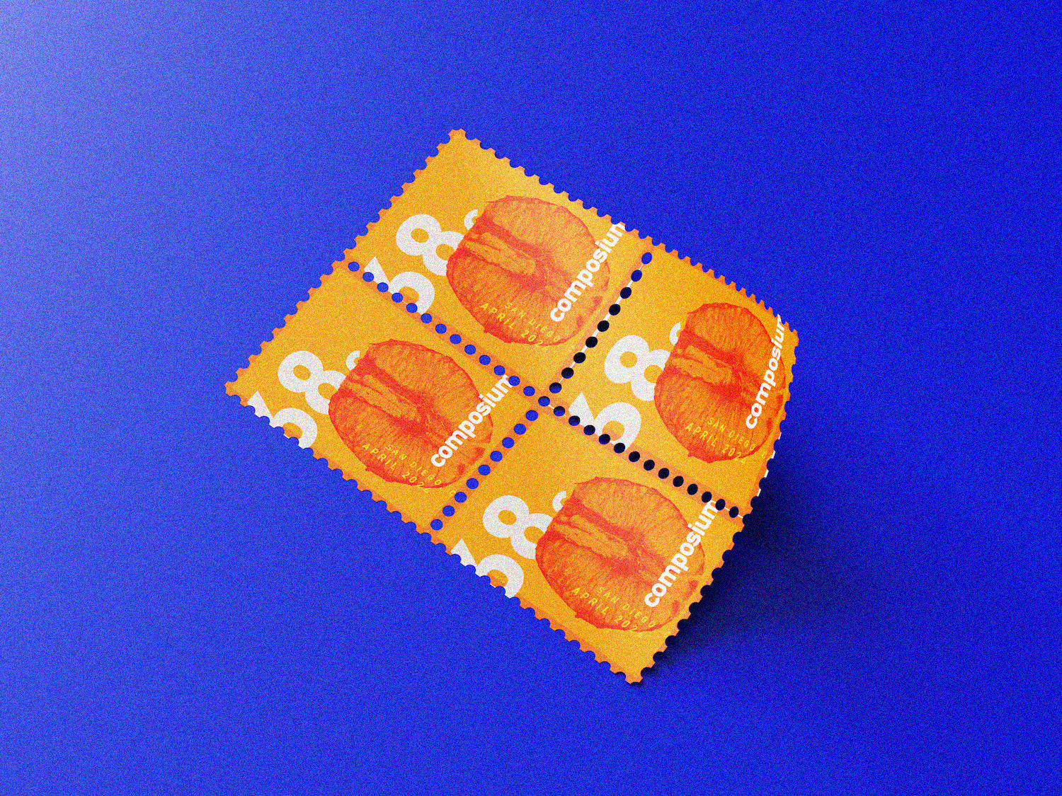
I photographed and edited an
orange peel to look like letters for added intrigue and chaos, to give a visual cue to the most classic item found in compost.
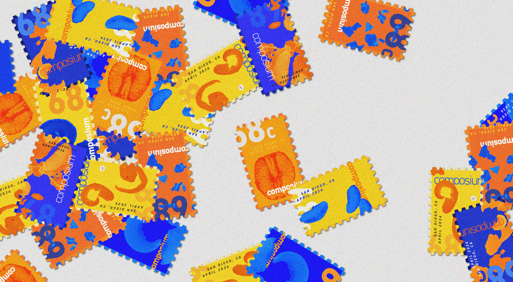
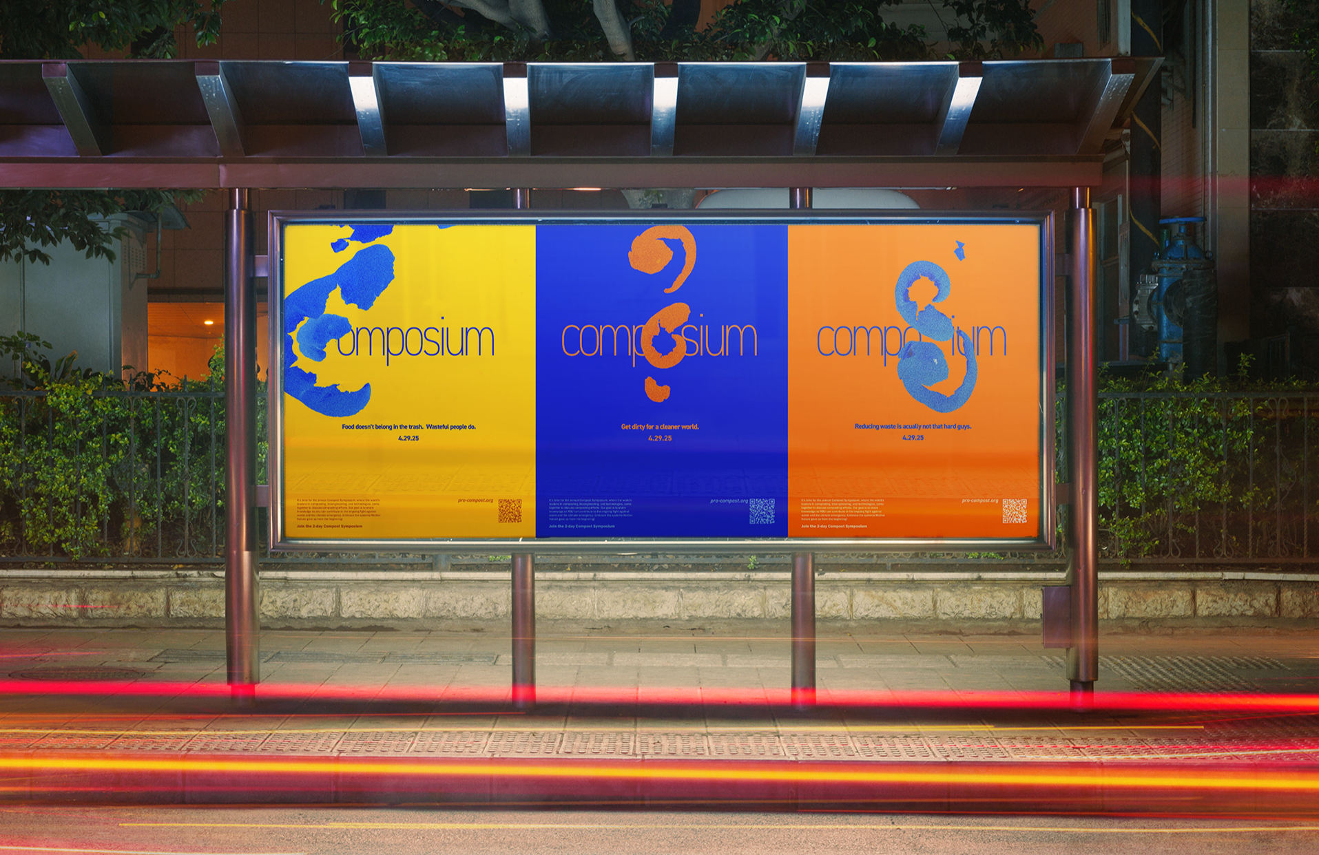
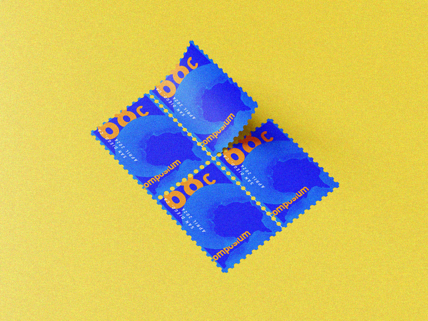
The challenge of this project was to see how many formats this design system could fit into. I wanted to be able to scale down the images from massive billboards to postage stamps.
Each size maintains its unique layout while fitting into a family. The stamps are very messy while the big billboards use clean symmetry, but the colors and type remain consistent.
up next