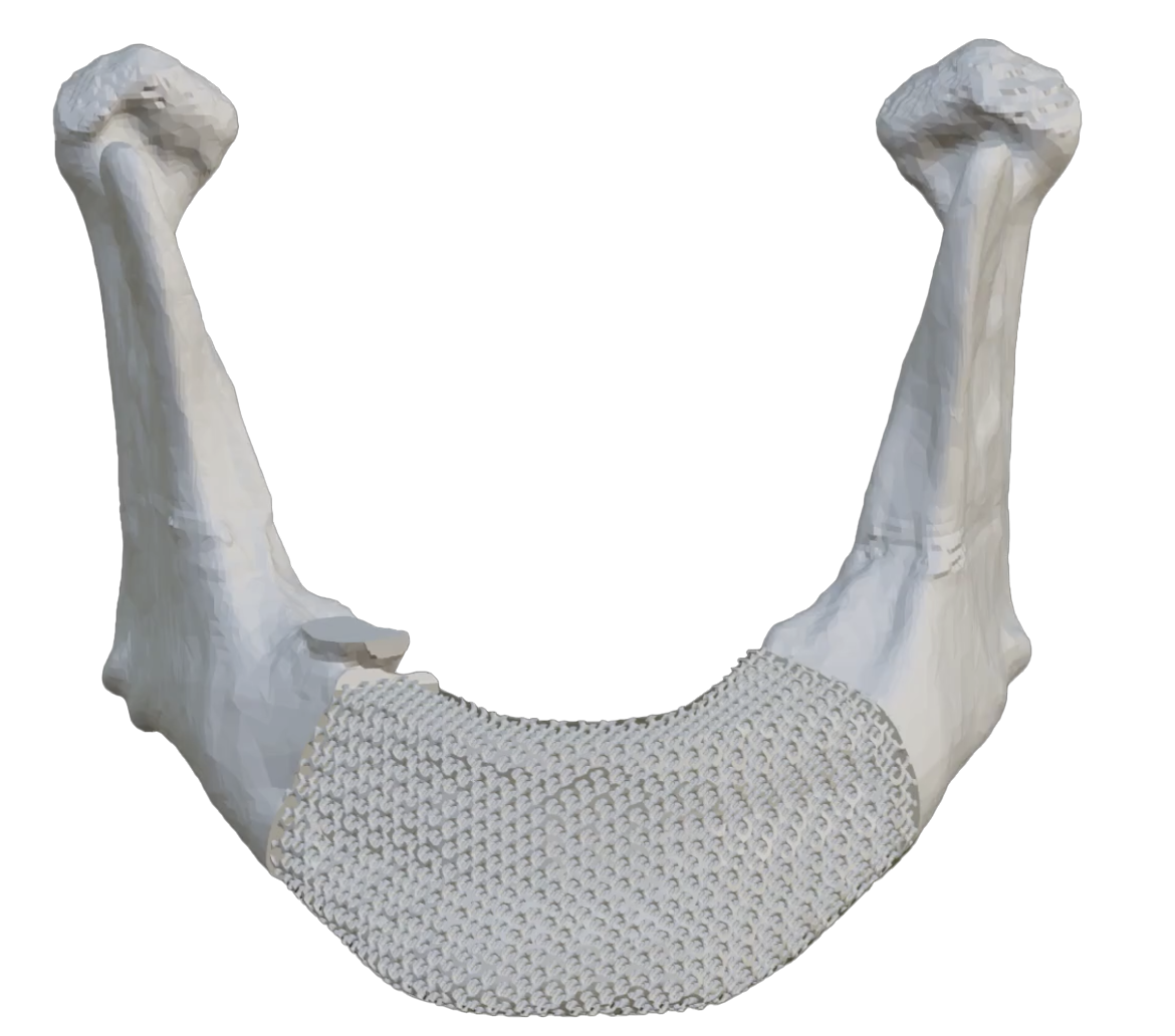
Bringing bone graft technology out of the research lab and into
the OR.
services
Branding
UX Research
UI Design
Frontend Development
Backend Development
The Brief
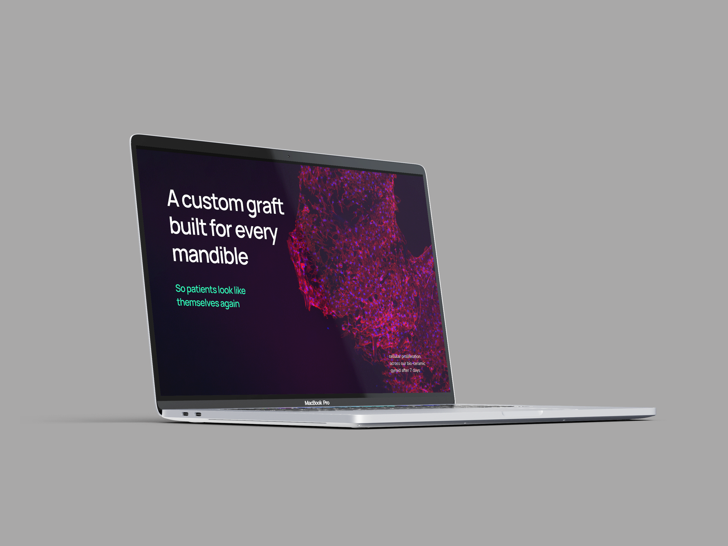
Medical brands often have a cold, corporate look with various shades of blue. I wanted GyroGel to stand out as a well-researched, biomedical engineering company, intended for patients as well as professionals.
The GyroGel team already had a name and an idea for type and color. However, they needed to solidify their credibility through brand consistency and an informative website that could display progress as it happened.
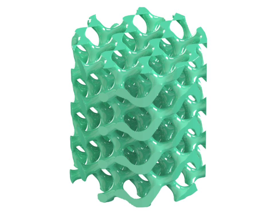
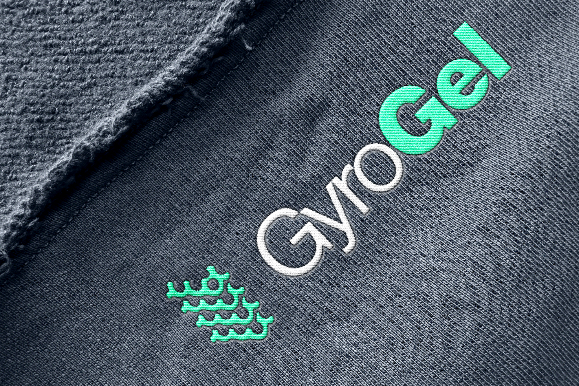
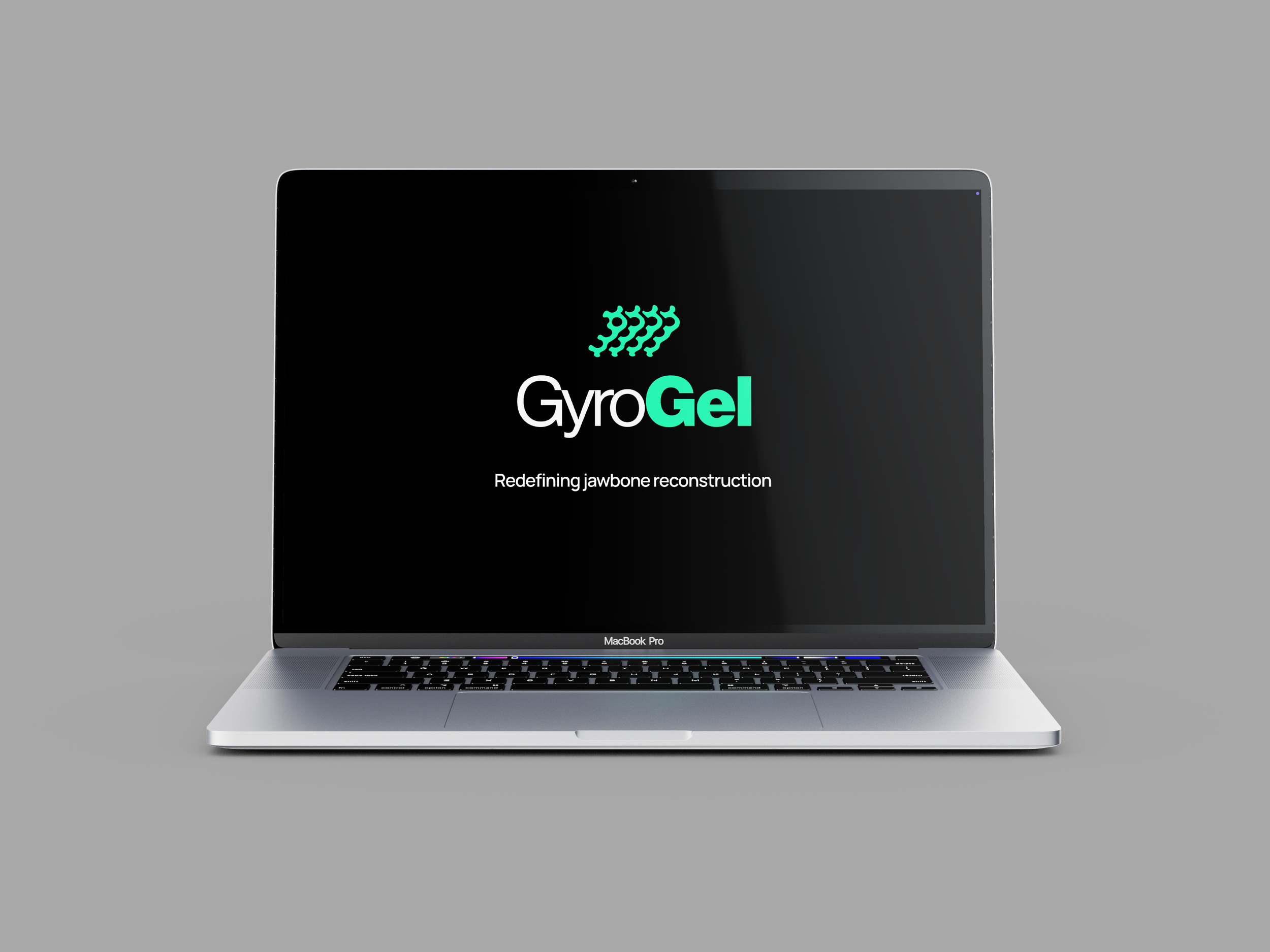
I was immediately drawn to the bright green, 3D-printed gyroids. They felt completely unique and central to the company’s identity. The logo makes the complex form simple, paired with typography that intersects with the kind of precision only a surgeon would have.


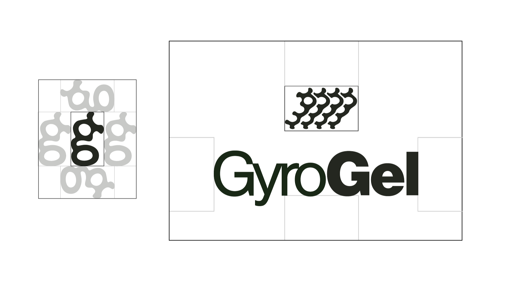
Logotype
I simplified the gyroid shape to appear softer and approachable for your everyday Joe, while showing exactly what the company prints. It comes with a sub-mark that can stand on its own or be scaled down.
This fun and distinctive pattern is contrasted with Helvetica, a very trustworthy typeface. The use of Roman and Black offers difference for pronunciation cues. I wanted to keep the tangents on the edges of the letters, as it demonstrates a precision and attention to detail that aligns with the company's scientific and aesthetic values, but I gave some spacing on the thicker letters for visual balance.
The green color is intriguing, calming,
and cool-toned, while not reminiscent of
hospital walls.

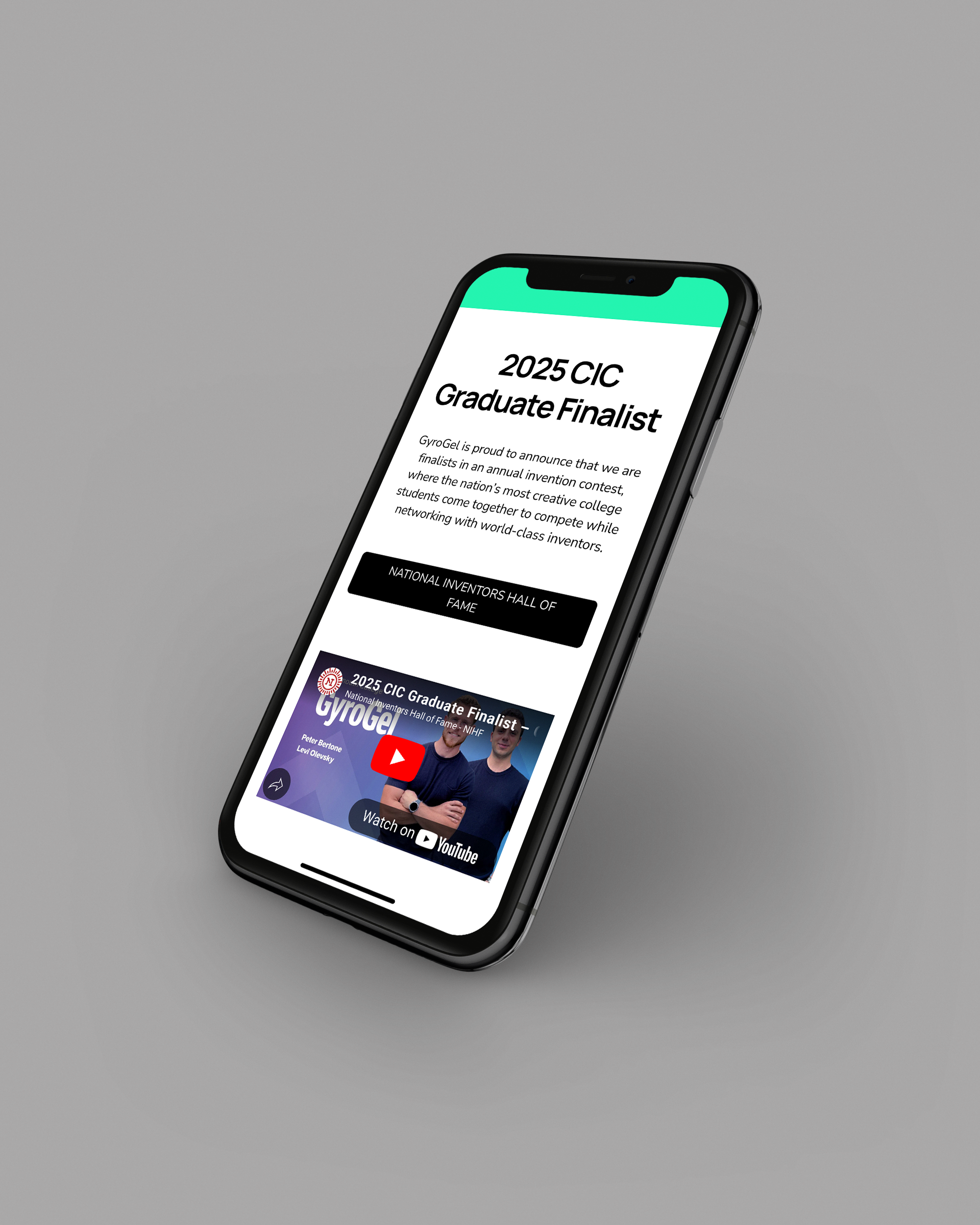
Website
The website is a simple, single-page application where patients, doctors, or biotech enthusiasts can learn more about
the technology and its recent discoveries.
I kept the layout very straightforward and clean, and the language understandable. Some viewers might be in a vulnerable position, since those using the technology might need jaw reconstruction surgery due to cancer or other issues. The colors, images, and language had to maintain optimism and comfort without sacrificing a sense of quality.
up next