


services
Business Model
Branding
Web Design
Copy Writing
Advertising
Photography

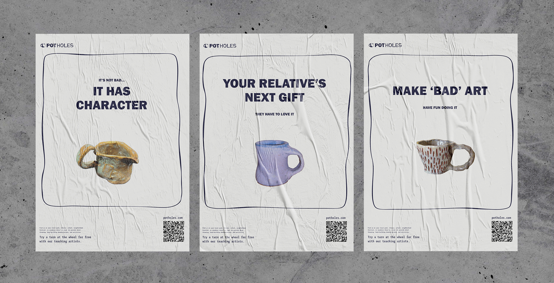
The brief
Applying an identity to an on-the-go,
ceramics studio.
The idea originated when I started Clay Club at my university in Boston. Almost everyone mentioned how they always wanted to try it, but never had an opportunity. It was either too expensive or overwhelming. Those comments stuck with me.
I wanted to make ceramics more accessible. Crack the door open. The best way to do that would be to offer classes for free and offer them anywhere. Thus, PotHoles is a Boston-based ceramic studio on wheels.


logotype
The clientele included non-artistic, financially challenged, or physically disabled people, as most studios are not wheelchair accessible. So, the logo had to be inviting and friendly while still looking professional. I didn't want the branding to suggest the product was not of quality. I didn't want it to look like charity.
The logo is manipulated from Franklin Gothic, a clean type with a touch of gooeyness to reflect the messiness and unpredictability.
of ceramics, which also gives it an unpretentious look.


branding
The headers are Franklin Gothic paired with Iki mono sans - a simple, geometric, readable body copy on the quirky side.
The business had to feel very Boston. Using the colors of the MBTA was a subtle nod to the city's iconic transit lines.


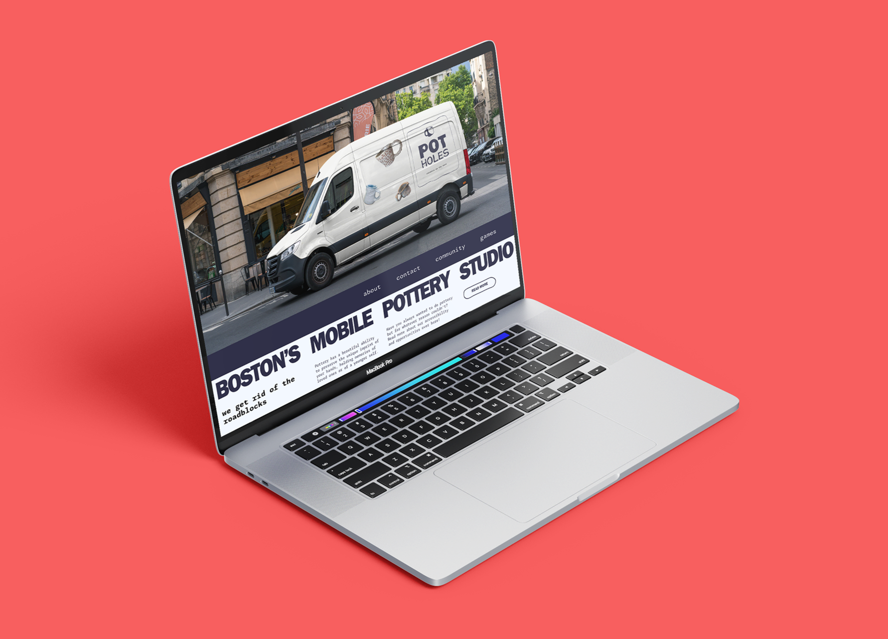
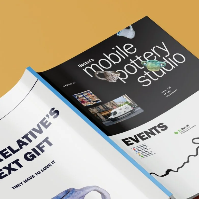
website
I needed a simple informational site with personality and style. The energy of the sight, colors, layout, type works within the core values - sophisticated with a touch of unseriousness.
The site acts as a Bat-Signal of sorts, telling folks where the events are, how they can get involved, and another fun surprise.
Although the business is not real, it was a blast combining my two passions into one project.
up next